77
Come combinare rotateX(50deg) rotateY(20deg) rotateZ(15deg) in stenografia rotate3d()?stendardo rotate3d
Come combinare rotateX(50deg) rotateY(20deg) rotateZ(15deg) in stenografia rotate3d()?stendardo rotate3d
rotateX(50deg) è equivalente a rotate3d(1, 0, 0, 50deg)
rotateY(20deg) equivale a rotate3d(0, 1, 0, 20deg)
rotateZ(15deg) equivale a rotate3d(0, 0, 1, 15deg)
Quindi .. .
rotateX(50deg) rotateY(20deg) rotateZ(15deg)
è equivalente a
rotate3d(1, 0, 0, 50deg) rotate3d(0, 1, 0, 20deg) rotate3d(0, 0, 1, 15deg)
Per un generico rotate3d(x, y, z, α), si ha la matrice
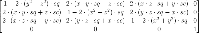
dove
è ora ottenere le matrici per ciascuno dei 3 rotate3d trasforma e li moltiplica. E la matrice risultante è la matrice corrispondente al singolo risultante rotate3d. Non sei sicuro di come sia facile estrarre i valori per rotate3d, ma è facile estrarli per un singolo matrix3d.
Nel primo caso (rotateX(50deg) o rotate3d(1, 0, 0, 50deg)), è necessario:
x = 1, y = 0, z = 0, α = 50deg
Quindi la prima riga della matrice in questo caso è 1 0 0 0.
La seconda è 0 cos(50deg) -sin(50deg) 0.
Il terzo 0 sin(50deg) cos(50deg) 0.
E il quarto è ovviamente 0 0 0 1.
Nel secondo caso, è necessario x = 0, y = 1, z = 0, α = 20deg.
Prima fila: cos(20deg) 0 sin(20deg) 0.
Seconda riga: 0 1 0 0.
Terza riga: -sin(20) 0 cos(20deg) 0.
Quarto: 0 0 0 1
Nel terzo caso, si ha x = 0, y = 0, z = 1, α = 15deg.
Prima fila: cos(15deg) -sin(15deg) 0 0.
Seconda riga sin(15deg) cos(15deg) 0 0.
E la terza e la quarta riga sono rispettivamente 0 0 1 0 e 0 0 0 1.
Nota: voi avranno notato che i segni dei valori per il peccato della RotateY trasformano sono diverse da quelle per gli altri due trasformate. Non è un errore di calcolo. La ragione di ciò è che, per lo schermo, hai l'asse y rivolto verso il basso, non verso l'alto.
Quindi questi sono i tre 4x4 matrici che è necessario moltiplicare al fine di ottenere la matrice 4x4 per la risultante singola rotate3d trasformazione. Come ho detto, non sono sicuro di quanto sia facile ottenere i 4 valori, ma i 16 elementi nella matrice 4x4 sono esattamente i 16 parametri dell'equivalente matrix3d della trasformazione concatenata.
EDIT:
In realtà, si scopre che è abbastanza facile ... Si calcola la traccia (somma degli elementi diagonali) della matrice per la matrice rotate3d.
4 - 2*2*(1 - cos(α))/2 = 4 - 2*(1 - cos(α)) = 2 + 2*cos(α)
È quindi calcolare la traccia per il prodotto delle tre 4x4 matrici, è equiparare il risultato con 2 + 2*cos(α) si estrae α. Quindi computi x, , z.
In questo caso particolare, se Computerizzata correttamente, la traccia della matrice risultante dal prodotto delle tre matrici 4x4 sta per essere:
T =
cos(20deg)*cos(15deg) +
cos(50deg)*cos(15deg) - sin(50deg)*sin(20deg)*cos(15deg) +
cos(50deg)*cos(20deg) +
1
Quindi cos(α) = (T - 2)/2 = T/2 - 1, il che significa che α = acos(T/2 - 1).
Sintassi:
rotate3d(x, y, z, a)
Valori:
x È un <number> descrive la coordinata x del vettore che indica l'asse di rotazione.y È un <number> che descrive la coordinata y del vettore che denota l'asse di rotazione.z È un <number> che descrive la coordinata z del vettore che denota l'asse di rotazione.a È un <angle> che rappresenta l'angolo della rotazione. Un angolo positivo indica una rotazione in senso orario, un angolo negativo in senso antiorario.Come in:
.will-distort{
    transform:rotate3d(10, 10, 10, 45deg);
}
con risposta come un signore. +1 – Michael
Forse sono spesso, ma penso che stia chiedendo un algoritmo per passare dalla trasformazione concatenata a un singolo 'rotate3d', non per la definizione di' rotate3d'. – Ana
Penso che voglia sapere come combinare rotateX (50deg) rotateY (20deg) rotateZ (15deg) in stenografia rotate3d() nei CSS –
Dipende da quello che stai cercando di fare, questo 'trucco' potrebbe aiutarti. Diciamo che stai facendo animazione, e vuoi aggiungere trasformazione dopo trasformazione e così via, e non vuoi che il CSS assomigli a 100 trasformazioni:
Questo funziona in chrome: 1. Applicare qualsiasi trasformazione vuoi un elemento. 2. La prossima volta che si desidera aggiungere una trasformazione, aggiungerla alla trasformazione calcolata: "window.getComputedStyle (elemento) .transform" - ma assicurarsi di inserire la nuova trasformazione a sinistra. 3. Ora la tua trasformazione sarà simile a "rotateZ (30deg) matrix3d (......). 4. La prossima volta che vuoi aggiungere un'altra trasformazione, ripeti il processo - Chrome riduce sempre le trasformazioni alla notazione matrix3d
TL;. DR applicare tutto quello che vuoi trasforma, e quindi ottenere la trasformazione Matrix3D calcolata
Questo trucco consente inoltre rapidamente (cioè, senza fare alcun calcolo da soli) fare una funzionalità che ruota un oggetto con rispetto al frame di riferimento in qualsiasi direzione.Vedere l'esempio di seguito:
EDIT: Ho aggiunto anche le traduzioni xyz. Usando questo, sarebbe molto facile collocare oggetti in specifiche posizioni 3d con specifici orientamenti in mente. Oppure ... immagina un cubo che rimbalza e cambia il suo asse di rotazione con ogni rimbalzo a seconda di come atterra!
\t var boxContainer = document.querySelector('.translator'),

\t  cube = document.getElementById('cube'),

\t  optionsContainer = document.getElementById('options');

\t var dims = ['x', 'y', 'z'];

\t var currentTransform;

\t var currentTranslate;

\t var init = function() {

\t  optionsContainer.querySelector('.xRotation input')

\t   .addEventListener('input', function (event) {

\t   if (currentTransform != 'none') {

\t    var newTransform = 'rotateX(' + (360 - event.target.value) + 'deg) ' + currentTransform;

\t   } else {

\t    var newTransform = 'rotateX(' + (360 - event.target.value) + 'deg)';

\t   }

\t   cube.style.transform = newTransform;

\t  }, false);


\t  optionsContainer.querySelector('.yRotation input')

\t   .addEventListener('input', function (event) {

\t   if (currentTransform != 'none') {

\t    var newTransform = 'rotateY(' + (360 - event.target.value) + 'deg) ' + currentTransform;

\t   } else {

\t    var newTransform = 'rotateY(' + (360 - event.target.value) + 'deg)';

\t   }

\t   cube.style.transform = newTransform;

\t  }, false);


\t  optionsContainer.querySelector('.zRotation input')

\t   .addEventListener('input', function (event) {


\t   if (currentTransform != 'none') {

\t    var newTransform = 'rotateZ(' + (360 - event.target.value) + 'deg) ' + currentTransform;

\t   } else {

\t    var newTransform = 'rotateZ(' + (360 - event.target.value) + 'deg)';

\t   }

\t   cube.style.transform = newTransform;

\t  }, false);


\t  optionsContainer.querySelector('.xTranslation input')

\t   .addEventListener('input', function (event) {


\t   if (currentTranslate != 'none') {

\t    var newTransform = 'translateX(' + (100 - event.target.value) + 'px) ' + currentTranslate;

\t   } else {

\t    var newTransform = 'translateX(' + (100 - event.target.value) + 'px)';

\t   }

\t   boxContainer.style.transform = newTransform;

\t  }, false);


\t  optionsContainer.querySelector('.yTranslation input')

\t   .addEventListener('input', function (event) {


\t   if (currentTranslate != 'none') {

\t    var newTransform = 'translateY(' + (100 - event.target.value) + 'px) ' + currentTranslate;

\t   } else {

\t    var newTransform = 'translateY(' + (100 - event.target.value) + 'px)';

\t   }

\t   boxContainer.style.transform = newTransform;

\t  }, false);

\t  optionsContainer.querySelector('.zTranslation input')

\t   .addEventListener('input', function (event) {


\t   if (currentTranslate != 'none') {

\t    var newTransform = 'translateZ(' + (500 - event.target.value) + 'px) ' + currentTranslate;

\t   } else {

\t    var newTransform = 'translateZ(' + (500 - event.target.value) + 'px)';

\t   }

\t   boxContainer.style.transform = newTransform;

\t  }, false);


reset();


\t };


\t function reset() {

\t  currentTransform = window.getComputedStyle(cube).transform;

\t  currentTranslate = window.getComputedStyle(boxContainer).transform;

\t  optionsContainer.querySelector('.xRotation input').value = 360;

\t  optionsContainer.querySelector('.yRotation input').value = 360;

\t  optionsContainer.querySelector('.zRotation input').value = 360;

\t  optionsContainer.querySelector('.xTranslation input').value = 100;

\t  optionsContainer.querySelector('.yTranslation input').value = 100;

\t  optionsContainer.querySelector('.zTranslation input').value = 500;


\t }


\t window.addEventListener('DOMContentLoaded', init, false);

\t document.addEventListener('mouseup', reset, false);
.translator
{
\t height: 200px;
\t position: absolute;
\t width: 200px;
transform-style: preserve-3d;
}
.threeSpace
{
\t height: 200px;
\t moz-perspective: 1200px;
\t o-perspective: 1200px;
\t perspective: 200px;
\t position: absolute;
\t transform-origin: 50px 50px 100px;
\t webkit-perspective: 1200px;
\t width: 100px;
perspective-origin: 100px 25px;
transform-style: preserve-3d;
}
#pointer{
position:relative;
height:2px;
width:2px;
top:25px;
left:100px;
background:blue;
z-index:9999;
}
#cube
{
\t height: 100%;
\t moz-transform-origin: 90px 110px 0px;
\t moz-transform-style: preserve-3d;
\t o-transform-origin: 90px 110px 0px;
\t o-transform-style: preserve-3d;
\t position: absolute;
\t transform-origin: 90px 110px 0px;
\t transform-style: preserve-3d;
\t webkit-transform-origin: 90px 110px 0px;
\t webkit-transform-style: preserve-3d;
\t width: 100%;
}
#cube .midPoint{
position:absolute;
top:48px;
left:48px;
height:1px;
width:1px;
background:green;
}
#cube figure
{
\t border: 2px solid black;
\t color: white;
\t display: block;
\t font-size: 60px;
\t font-weight: bold;
\t height: 96px;
\t line-height: 96px;
\t position: absolute;
\t text-align: center;
\t width: 96px;
/* transform-style: preserve-3d; */
}
#cube .front
{
\t background: hsl(0, 100%, 50%);
}
#cube .back
{
\t background: hsl(60, 100%, 50%);
}
#cube .right
{
\t background: hsl(120, 100%, 50%);
}
#cube .left
{
\t background: hsl(180, 100%, 50%);
}
#cube .top
{
\t background: hsl(240, 100%, 50%);
}
#cube .bottom
{
\t background: hsl(300, 100%, 50%);
}
#cube .front
{
\t moz-transform: translateZ(50px);
\t o-transform: translateZ(50px);
\t transform: translateZ(50px);
\t webkit-transform: translateZ(50px);
}
#cube .back
{
\t moz-transform: rotateX(-180deg) translateZ(50px);
\t o-transform: rotateX(-180deg) translateZ(50px);
\t transform: rotateX(-180deg) translateZ(50px);
\t webkit-transform: rotateX(-180deg) translateZ(50px);
}
#cube .right
{
\t moz-transform: rotateY(90deg) translateZ(50px);
\t o-transform: rotateY(90deg) translateZ(50px);
\t transform: rotateY(90deg) translateZ(50px);
\t webkit-transform: rotateY(90deg) translateZ(50px);
}
#cube .left
{
\t moz-transform: rotateY(-90deg) translateZ(50px);
\t o-transform: rotateY(-90deg) translateZ(50px);
\t transform: rotateY(-90deg) translateZ(50px);
\t webkit-transform: rotateY(-90deg) translateZ(50px);
}
#cube .top
{
\t moz-transform: rotateX(90deg) translateZ(50px);
\t o-transform: rotateX(90deg) translateZ(50px);
\t transform: rotateX(90deg) translateZ(50px);
\t webkit-transform: rotateX(90deg) translateZ(50px);
}
#cube .bottom
{
\t moz-transform: rotateX(-90deg) translateZ(50px);
\t o-transform: rotateX(-90deg) translateZ(50px);
\t transform: rotateX(-90deg) translateZ(50px);
\t webkit-transform: rotateX(-90deg) translateZ(50px);
}
#options{
position:absolute;
width:80%;
top:40%;
}
#options input
{
\t width: 60%;
}<body>
<div class="threeSpace">
<div id="pointer"></div>
<div class="translator">
<div id="cube">
<figure class="front"><div class='midPoint'></div></figure>
<figure class="back"></figure>
<figure class="right"></figure>
<figure class="left"></figure>
<figure class="top"></figure>
<figure class="bottom"></figure>
</div>
</div>
</div>
<section id="options">
<p class="xRotation">
<label>xRotation</label>
<input type="range" min="0" max="720" value="360" data-units="deg" />
</p>
<p class="yRotation">
<label>yRotation</label>
<input type="range" min="0" max="720" value="360" data-units="deg" />
</p>
<p class="zRotation">
<label>zRotation</label>
<input type="range" min="0" max="720" value="360" data-units="deg" />
</p>
<p class="xTranslation">
<label>xTranslation</label>
<input type="range" min="0" max="200" value="100" data-units="deg" />
</p>
<p class="yTranslation">
<label>yTranslation</label>
<input type="range" min="0" max="200" value="100" data-units="deg" />
</p>
<p class="zTranslation">
<label>zTranslation</label>
<input type="range" min="0" max="1000" value="500" data-units="deg" />
</p>
</section>
</body>Questo è uno dei post più utili di sempre, grazie –
La risposta epica è epica. Upvoted. –
sì, non so nemmeno come sia possibile verificarlo. Stavo andando completamente fino a quando ho visto il peccato. perché mi ha aperto la testa. quando ho visto il peccato shoutout asso di base –
@AndrewLuhring Incredibile. – aendrew